
This article was originally written in Japanese on May 19, 2020.
Last month, we posted an early insights into the quality data of video streaming services gathered from our Web VideoMark project participants in February and March, during the COVID-19 crisis. We have extended our coverage until May 10 to look into the trends between the declaration of the national state of emergency and a prime holiday season in Japan called the Golden Week.
Background: Internet traffic spike
Under the state of emergency, numerous people are working or studying remotely and enjoying online entertainment services at home. As a result, a massive hike in the Internet traffic has been observed by network providers, including JPIX, JPNAP, NTT Communications, NTT East and NTT West.
Putting all these reports together, as pointed out by the Japanese government’s Internet traffic efficiency committee, the national Internet traffic has increased by 30% to 50% during weekday daytime, 10% to 20% during weekend daytime, and 10% in the evening on both weekdays and weekends between late February and mid-April.
Trends in network quality: transmission speeds and response times
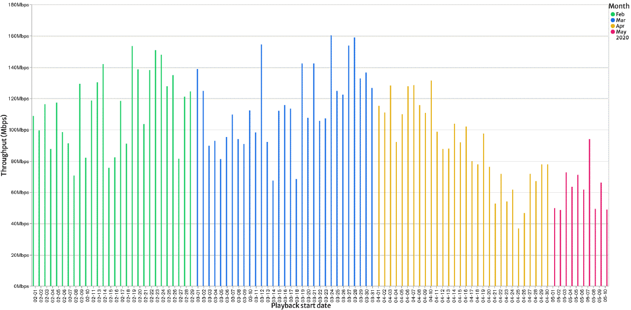
So, how the communication quality is affected when people use actual services? We have analyzed data measured client-side, including the transmission speed, which is the throughputs of video file downloads, and the response times from CDN servers.
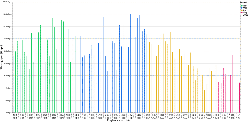
The following graphs show the average transmission speeds and response times, the daily average of per-view average, between February and May. As discussed in our previous post, we couldn’t find any significant trends in February and March, even though there were some differences between weekdays and weekends in addition to some statistical variations.
However, slower transmissions and responses can be observed around April 7, when the state of emergency was declared for Tokyo and six other provinces, as well as April 16, when it was expanded nationwide.
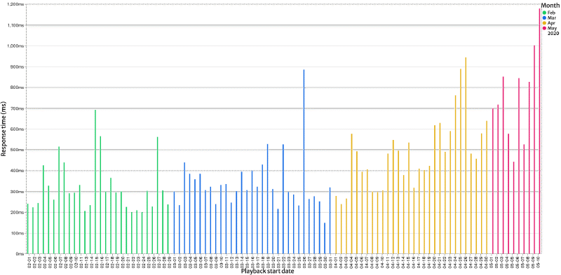
If we see March 26, for example, there is a significant peak in the average response times. This particular day had many samples of prolonged responses. The average between 1 and 2 a.m. was longer than 5000ms, which contributed to 6% of the day’s statistics. It was over 2700ms between midnight and 1 a.m. as well as 9 and 10 p.m., which also accounted for 9% each.
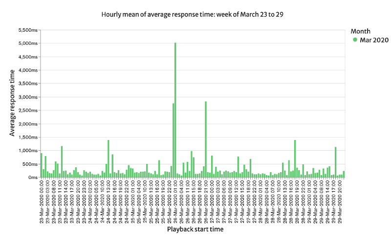
Since we don’t have an adequate number of samples yet, the daily breakdown contains some extreme values. Still, we believe that this sort of data is meaningful from a micro-perspective because there were actual users who experienced a poor network environment.
We can see smoother macro-perspective results by taking regular averages or moving averages with extreme values excluded. It’s also possible to focus on these values from a micro-perspective. We didn’t eliminate anomalies from the data shown in this post.
When comparing the monthly averages, the transmission slowed down by 24% in April and 47% in May (first 10 days) from the average of February and March. The response times also increased by 53% in April and 144% in May, respectively.
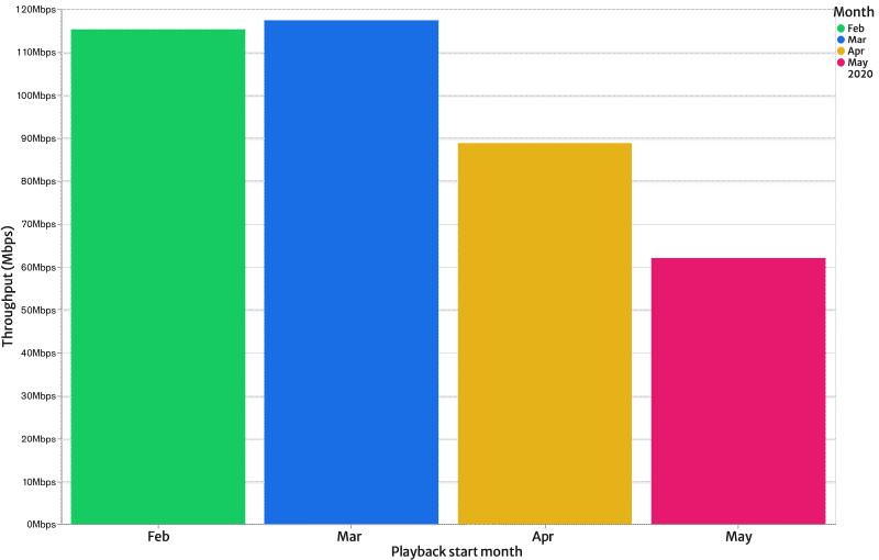
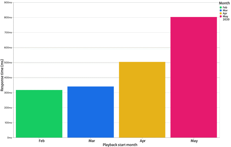
These statistics are based on the simple daily averages of logs collected from Web VideoMark participants. It means there are many variables in the population (more devices, more views), their network (home, school or office), and streaming servers (busy hours) during the period. The views vary by hour, and we only analyze simple daily averages, so the results are biased toward the prime time when more people watch videos.
Therefore, the data doesn’t imply that the entire Internet speed went down to the half, or the loading times became 2.4 times longer. Still, given that we measure against servers, which are usually a robust and stable CDN like YouTube, these stats should be reflecting the Internet quality and congestions that people perceive when they use the actual services.
QoE trends on YouTube
The quality of experience (QoE) for video streaming users has not significantly been affected by the slower transmissions and longer response times. That’s because bitrates required for video playback are orders of magnitude less than the download speed, as mentioned in our previous post.
Considering the number of users on each service is a variable, we just focused on YouTube that draws the majority of the users. The daily QoE in this first half-year until May 19 look like this:

The graph contains several anomalies, just like the response times we saw earlier. Still, we don’t recognize any particular trend because, in our understanding, bandwidth shortages leading to lower resolutions and bitrates are not often happening.
Note: We estimate QoE values from various parameters like resolutions, bitrates, and pausing times during video playback. The QoE of the entire service usage, including negative impacts of slower page loads or navigations, is not taken into account in this analysis.
The population and trends in their watching behavior
In our previous post, we looked into the data in February and March. Now let’s extend the coverage until May 10 to see how the hourly views totaling 28,005 look like on weekdays and weekends:
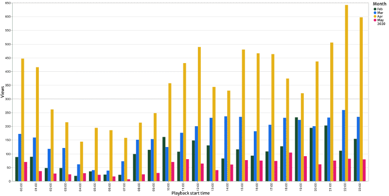
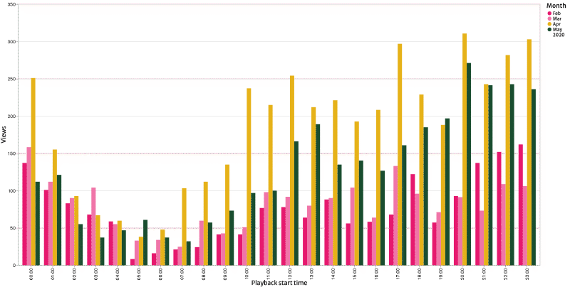
On the whole, the number of views has increased since April. While our active user base (project participants) grown by 10% between early March and early April, the April views were 2.2 times greater than March. We can conclude that the use of video streaming services had spiked following the state of emergency declarations.
The hourly graphs vary widely, but it seems there are slightly more views after March during weekday daytime that previously had fewer viewers.
Call for participation
For the Web VideoMark project, we are gathering data from volunteers opted into our online research, analyzing the network and QoE on actual services, and publishing the outcomes as open data. We’ll be posting analytics charts like ones shown in this article to the statistics page.
If you’re interested, please visit our project page, install an extension to one of the supported browsers including Chrome and Edge, and watch videos as usual. You don’t have to do anything else. It’s an online quality research anyone can easily participate, so join us today!
Besides, we can provide detailed data and briefing to network carriers, video service providers and researchers. Drop us a line if it sounds beneficial to you.